")
The Role of Pastel Colors in Interior Design
Why Choose Pastel Colors?
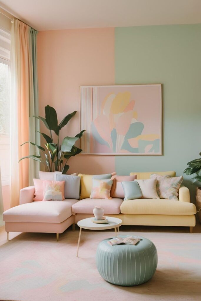
Pastel colors, such as soft pinks, blues, greens, and yellows, are associated with calmness and sophistication. These shades can:
- Create a sense of spaciousness.
- Reflect natural light to make rooms appear brighter.
- Complement a variety of decor styles, from minimalist to classic.
Psychological Benefits
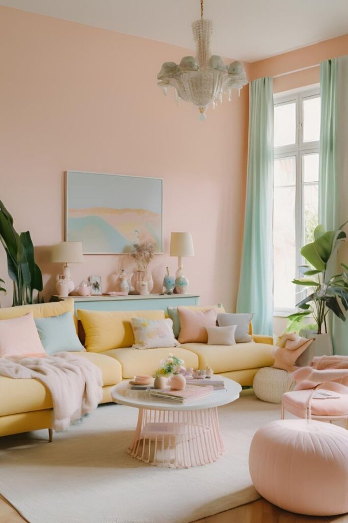
The psychological impact of pastel colors is noteworthy. They reduce stress and create a relaxing atmosphere. For instance, pastel blue walls can evoke feelings of tranquility, making them perfect for bedrooms or study areas.
Popular Combinations
Some popular pastel color combinations include:
- Mint green and blush pink: Ideal for modern living rooms.
- Lavender and soft gray: Perfect for creating a sophisticated bedroom.
- Powder blue and white: Great for bathrooms or kitchens.
Pastel Color Wardrobes
What Is a Pastel Color Wardrobe?
A pastel color wardrobe refers to storage units painted or finished in pastel shades. These wardrobes can be:
- Freestanding units.
- Built-in designs.
- Modular systems.
Benefits of a Pastel Color Wardrobe
- Aesthetic Appeal: A pastel color wardrobe design can instantly uplift the look of your bedroom or dressing area.
- Versatility: These shades blend seamlessly with neutral or bold accents.
- Timelessness: Pastels are trendy yet timeless, ensuring your wardrobe doesn’t look outdated over the years.
Tips for Designing a Pastel Color Wardrobe
- Choose soft peach or beige for a neutral look.
- Combine pastel tones with mirrored panels for a luxurious touch.
- Add gold or brass hardware for a chic appearance.
Real-Life Example
A pastel green wardrobe with white handles became a statement piece in a Scandinavian-style apartment. The light green tone added freshness, while the white accents maintained minimalism.
Pastel Colors Wall Paint
Advantages of Using Pastel Colors for Walls
- Brightens Spaces: Pastel walls reflect light, making small rooms feel larger.
- Flexible Design: These shades serve as a perfect canvas for other design elements, such as bold furniture or artwork.
- Mood Enhancement: Soft pastel colors wall paint can elevate your mood and make your home feel inviting.
Popular Pastel Wall Paint Options
- Baby pink walls: Perfect for nurseries or feminine bedrooms.
- Sky blue walls: Ideal for bathrooms or home offices.
- Lemon yellow walls: Adds a cheerful vibe to living rooms or kitchens.
How to Choose the Right Pastel Color
- Room Purpose: Use calming shades like lavender for bedrooms and energizing shades like peach for dining areas.
- Natural Light: Rooms with limited natural light benefit from pastel yellows and creams.
- Complementary Decor: Match pastel walls with neutral furniture or colorful accessories.
Case Study
In a 3BHK apartment in Gurgaon, pastel blue walls were paired with white furniture to create a coastal-themed living room. The result was a space that felt both airy and relaxing.
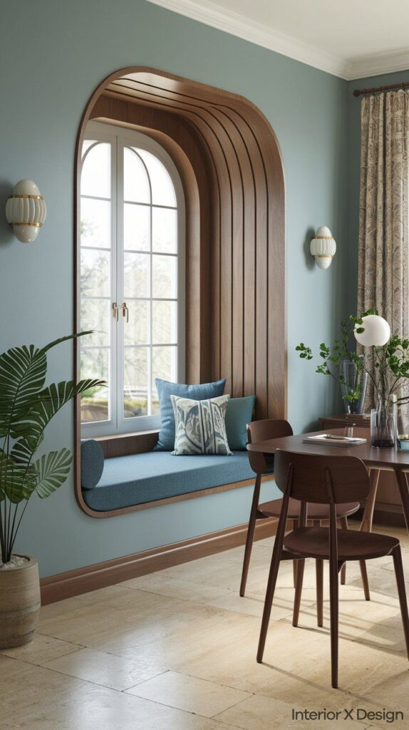
Curtains in Pastel Colors
Why Opt for Pastel Curtains?
Pastel curtains offer a subtle way to introduce these hues into your interiors. They:
- Diffuse sunlight beautifully.
- Provide a soft contrast to bold walls.
- Enhance the overall ambiance of the room.
Styling Tips for Pastel Curtains
- Layer pastel curtains with sheer fabrics for a dreamy effect.
- Use patterns like stripes or floral prints to add personality.
- Pair pastel curtains with metallic curtain rods for a contemporary look.
Best Pastel Shades for Curtains
- Blush pink: Complements gray or beige walls.
- Soft lavender: Pairs well with white or cream furniture.
- Pale aqua: Ideal for beach-inspired themes.
Real-Life Example
In a penthouse in South Delhi, pastel yellow curtains with subtle floral embroidery transformed the living area into a cheerful yet elegant space.
Integrating Pastel Colors into Your Interior Design
Coordinating Pastel Elements
To achieve a cohesive look:
- Match pastel walls with complementary wardrobes and curtains.
- Use rugs, cushions, and throws in pastel hues to tie the design together.
Balancing Pastels with Bold Accents
Introduce bold decor pieces, such as:
- A navy blue sofa against pastel pink walls.
- Bright artwork on pastel green walls.
Common Mistakes to Avoid
- Overusing pastels, which can make the room look washed out.
- Ignoring textures, as monotone pastels can appear flat without contrasting materials.
FAQs About Using Pastel Colors in Interior Design
Can I mix pastels with dark colors?
Yes, combining pastels with dark shades like navy or charcoal adds depth and contrast to your interiors.
Are pastel colors suitable for all rooms?
Absolutely! They work well in bedrooms, living rooms, kitchens, and even bathrooms. Choose shades based on the function and mood of the room.
How do I maintain pastel-colored furniture and walls?
Regular dusting and using mild cleaning solutions help maintain the freshness of pastel shades.
Conclusion
Using pastel colors in interior design—whether for wardrobes, curtains, or walls—can create a home that feels calm, stylish, and inviting. By incorporating pastel color wardrobe designs, pastel colors wall paint, and pastel curtains, you can achieve a harmonious look that reflects your personal style.
For more inspiration, visit our blog or explore our residential design services. For tailored advice, contact our interior design consultants in Delhi or Gurgaon.