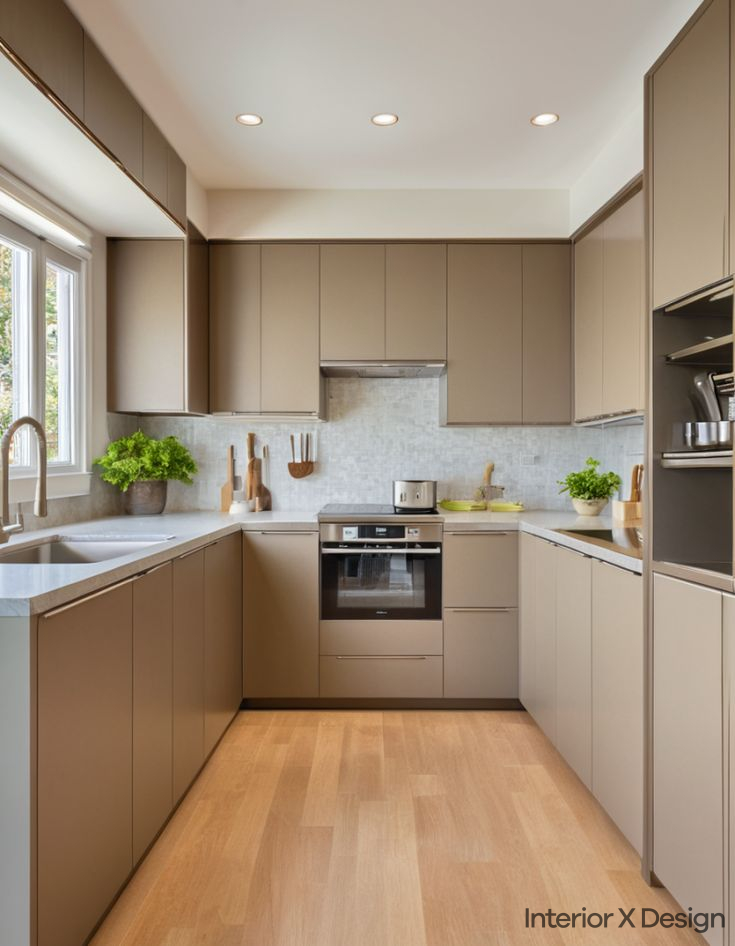
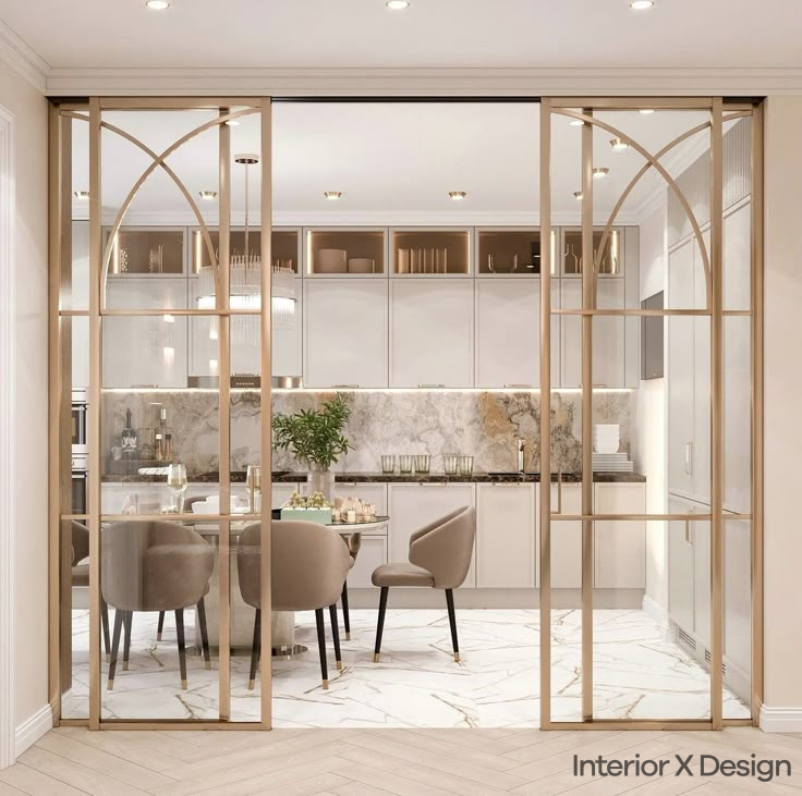
1. Classic White and Navy Blue

White is a timeless choice, and when paired with navy blue, it creates a sophisticated yet calm environment. The contrast between light and dark adds depth while keeping the space open and airy.
Why Choose White and Navy Blue?
- Clean and Elegant: The contrast provides a refined, polished look.
- Works for All Sizes: Ideal for both compact and spacious bathrooms.
- Versatile Style: Complements modern, traditional, or industrial designs.
Practical Tips:
- Flooring: Use white or light-colored tiles to maintain an open feel.
- Accents: Incorporate navy blue through towels, cabinets, or a feature wall.
- Lighting: Warm lighting softens the contrast for a cozy ambiance.
2. Soft Grey and Mint Green

Soft grey and mint green create a fresh, calming atmosphere. Grey provides a contemporary base, while mint green adds a touch of vibrancy.
Why Choose Soft Grey and Mint Green?
- Relaxing Vibe: Mint green adds freshness, enhancing relaxation.
- Space-Enhancing: Light grey walls make small bathrooms feel larger.
- Modern Appeal: Perfect for minimalist and contemporary designs.
Practical Tips:
- Walls & Tiles: Use soft grey on walls and mint green tiles as accents.
- Storage: Opt for mint green cabinets to bring subtle color.
- Accessories: Towels and rugs in these shades tie the look together.
3. Earthy Beige and Terracotta

For a warm and natural aesthetic, beige and terracotta provide a cozy, rustic charm. This combination complements natural materials like wood and stone.
Why Choose Beige and Terracotta?
- Warm and Inviting: Creates a welcoming and relaxed feel.
- Organic Appeal: Works well in eco-friendly and natural designs.
- Timeless Choice: Stays stylish for years.
Practical Tips:
- Flooring & Walls: Beige tiles paired with terracotta flooring create harmony.
- Wood Elements: Add wooden shelves or furniture for a natural feel.
- Textiles: Use terracotta-colored towels or rugs for accents.
4. Bold Black and Gold

A black and gold combination exudes luxury and sophistication. This high-contrast design is ideal for making a statement.
Why Choose Black and Gold?
- Elegant and Luxurious: Adds a glamorous touch.
- Dramatic Contrast: Black provides depth, while gold adds warmth.
- Best for Large Bathrooms: Works well in spacious areas where bold tones shine.
Practical Tips:
- Tiles & Fixtures: Black tiles with gold faucets and mirrors enhance luxury.
- Accent Wall: A black feature wall with gold trim adds a focal point.
- Lighting: Warm gold lighting balances the dark tones.
5. Fresh White and Aqua Blue

A white and aqua blue combination creates a light, airy space reminiscent of ocean breezes. This is ideal for achieving a bright and refreshing feel.
Why Choose White and Aqua Blue?
- Bright & Open: White enhances natural light, making the space feel larger.
- Ideal for Small Bathrooms: Perfect for compact washrooms.
- Coastal Aesthetic: Complements beach-inspired interiors.
Practical Tips:
- Wall Tiles: White walls with aqua blue feature tiles add interest.
- Accessories: Use aqua blue towels and bath mats for subtle color pops.
- Lighting: Cool lighting complements the color scheme.
6. Warm Taupe and White

Taupe and white create a cozy yet sophisticated environment. This neutral combination is perfect for those who prefer understated elegance.
Why Choose Taupe and White?
- Neutral and Timeless: A balanced and long-lasting choice.
- Creates Warmth: Taupe brings warmth, preventing a stark look.
- Pairs Well with Wood & Stone: Works beautifully with natural elements.
Practical Tips:
- Wall Shades: Light taupe walls with white ceilings keep the space bright.
- Wood Accents: Wooden shelves or vanities complement the warmth.
- Soft Textiles: Use white towels and beige rugs for a seamless blend.
7. Soft Lavender and Charcoal Grey

Lavender and charcoal grey provide a modern yet soothing color combination. The soft purple tones contrast beautifully with the deep grey, creating an elegant look.
Why Choose Lavender and Charcoal Grey?
- Soothing Effect: Lavender brings a gentle, calming touch.
- High Contrast Appeal: Charcoal grey adds depth and sophistication.
- Ideal for Modern Spaces: Works well with contemporary designs.
Practical Tips:
- Feature Walls: Use lavender for accent walls while keeping charcoal as the base.
- Metallic Touches: Silver or chrome fixtures complement this combination.
- Soft Accessories: Light purple towels or bath mats complete the look.
Common Mistakes to Avoid
1. Choosing Dark Colors for Small Bathrooms
Dark tones can make a compact bathroom feel even smaller. If using dark colors, balance them with lighter shades and strategic lighting.
2. Ignoring Lighting Conditions
Natural and artificial lighting impact how colors appear. Always test color samples under different lighting before finalizing your choice.
3. Overloading with Too Many Colors
A bathroom should have a harmonious palette. Stick to two or three complementary shades for a cohesive look.
4. Neglecting Moisture-Resistant Paints
Bathrooms are exposed to high humidity. Choose moisture-resistant paints to prevent peeling and mold growth.
5. Forgetting About Texture
Textures play a key role in enhancing the color scheme. Matte, glossy, and natural finishes can change how colors interact in the space.
Final Thoughts
Selecting the right bathroom colour combination enhances the aesthetic and functionality of your space. Whether you prefer timeless neutrals, bold contrasts, or calming pastels, the right choice can elevate your bathroom’s style. Use this guide to create a space that reflects your taste while maintaining practicality and elegance.
For more home decor tips, explore our other guides:

