Introduction to Wine Colour Combination
Wine colours, including deep reds, purples, and burgundies, add warmth and sophistication to interiors. They pair well with various shades, from neutrals to bold contrasts. Understanding how to balance wine tones ensures a refined and visually appealing result.
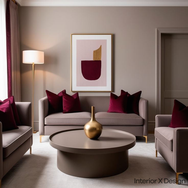
1. Wine and Gold: A Classic Luxury

Pairing wine with gold creates an opulent aesthetic. Gold enhances the richness of wine tones, making it ideal for formal spaces.
- Best spaces: Master bedrooms, dining rooms, living rooms
- Balancing the look: Use gold sparingly through trims, mirrors, or light fixtures to prevent overwhelming the space.
2. Wine and Grey: The Modern Elegance

The cool tones of grey balance the warmth of wine, offering a contemporary look.
- Best spaces: Living rooms, dining areas, home offices
- Balancing the look: Use soft greys in furniture and rugs while incorporating wine in accent walls or decor.
Wine and White: The Timeless Contrast

The contrast between deep wine and crisp white creates a balanced and fresh ambiance.
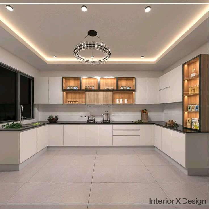
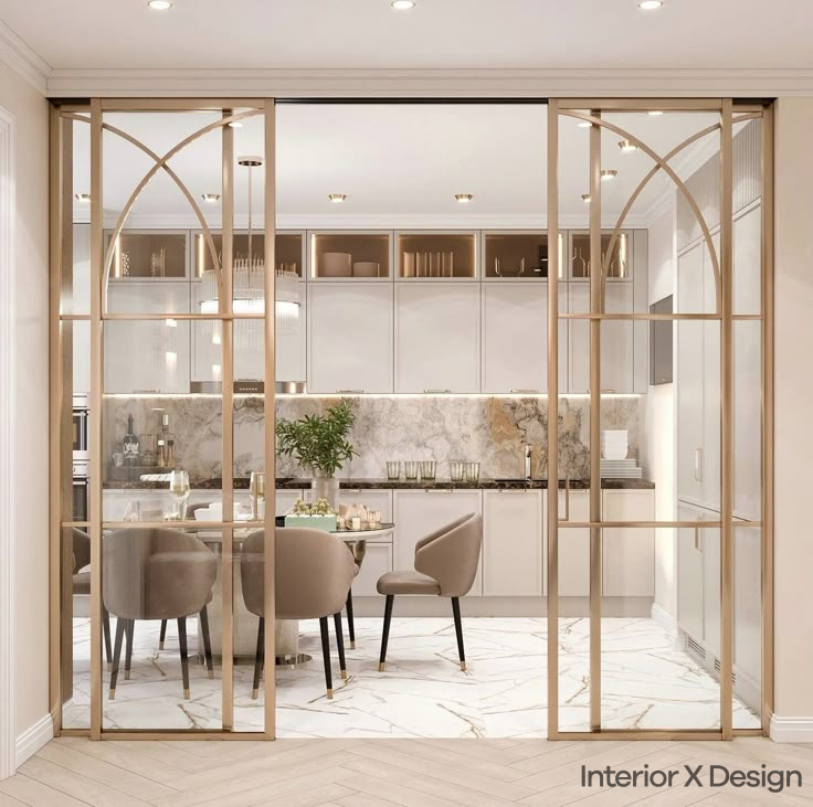
- Best spaces: Kitchens, living rooms, entryways
- Balancing the look: Keep wine accents minimal to allow them to stand out against the white backdrop.
Wine and Black: Bold and Beautiful

This striking combination is ideal for a dramatic and sophisticated look.
- Best spaces: Feature walls, modern interiors, bedrooms
- Balancing the look: Incorporate lighter elements like grey or beige furniture to prevent the space from feeling too dark.
Wine and Cream: A Soft, Subtle Touch
A softer approach to using wine, this combination creates a cozy and inviting setting.
- Best spaces: Bedrooms, living rooms
- Balancing the look: Use wine as an accent while letting cream dominate the space.
Tips for Using Wine Colour Combinations in Different Spaces
Incorporating wine colours into different spaces in your home requires thoughtfulness to ensure the combination enhances the overall atmosphere. Here are some tips for using wine colour combinations in various rooms:
Wine Colour Bedroom Ideas
Wine colour combinations can add a sense of richness and warmth to your bedroom. A wine-coloured accent wall paired with soft neutral tones like beige, grey, or white creates an inviting space that promotes relaxation. Consider using wine-coloured curtains or bedding for a cozy and sophisticated vibe.
- Wine Bedroom Tip: Wine and white work well in the bedroom to create a clean, timeless aesthetic. Pairing wine accent furniture, such as a velvet wine-coloured headboard, with crisp white bed linens can create a refined, restful look.
Wine Colour Living Room Ideas
In the living room, wine colours can serve as the perfect backdrop for stylish furniture and decor. Pair wine-toned walls with light or dark contrasting colours like cream, grey, or gold. Wine-coloured furniture or accessories like cushions, curtains, and rugs will help balance the space and add texture.
- Wine Living Room Tip: To avoid overwhelming the space, consider creating a feature wall in a wine shade and keeping the rest of the room neutral. This will create a sense of balance and prevent the room from feeling too dark or heavy.
Wine Contrast Colour for Accent Walls
Using wine as an accent wall is a great way to add character without committing to an entire room of deep colour. Pairing a wine-coloured accent wall with lighter shades of grey, white, or cream allows the wall to stand out without dominating the space.
- Wine Accent Wall Tip: Consider pairing a wine accent wall with light grey or beige furniture to keep the focus on the feature wall. This combination will create depth while keeping the space feeling airy and fresh.
Comparisons of Wine Colour Combination
| Combination | Style | Best Used In | Key Tip |
|---|---|---|---|
| Wine & Gold | Luxurious | Bedrooms, Dining Rooms | Use gold accents minimally |
| Wine & Grey | Modern | Living Rooms, Offices | Pair soft greys with wine walls |
| Wine & White | Classic | Kitchens, Entryways | Keep wine elements limited |
| Wine & Black | Bold | Feature Walls, Bedrooms | Add light furniture to balance |
| Wine & Cream | Soft | Bedrooms, Living Rooms | Use wine subtly as an accent |
Common Mistakes When Using Wine Colour Combinations
- Overuse of dark tones: Too much wine or black can make a space feel smaller.
- Ignoring natural light: Dark shades can feel heavy in low-light areas.
- Mismatched tones: Ensure complementary undertones for harmony.
- Lack of contrast: Pair wine with lighter hues to enhance its richness.
Conclusion
Wine colour combinations offer endless possibilities for creating stylish and sophisticated spaces. From the classic pairing of wine and gold to the bold contrast of wine and black, these colour combinations can transform any room in your home. Whether you’re looking to create a luxurious atmosphere, a modern and elegant space, or a calm and inviting environment, wine colour combinations provide the perfect foundation for your design.
If you’re looking for professional advice and tailored interior design services, check out our team of expert interior designers in Delhi for more personalized tips and ideas.