Below are the top 5 drawing room colour combinations to help you design a space that is both stylish and comfortable.
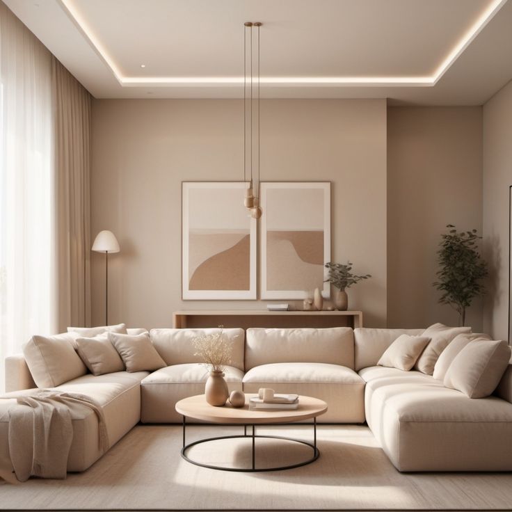
1. Classic Neutral Drawing Room Colours

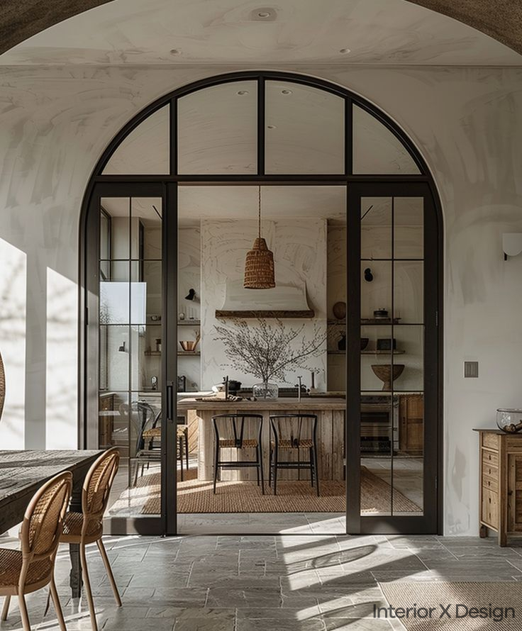
Neutral tones have long been a favourite due to their versatility and timeless appeal. These colours provide a sophisticated backdrop, allowing easy integration of furniture, artwork, and accessories. If you prefer a light colour combination, neutrals are the best choice.
Why Neutral Colours Work
Neutral shades like beige, ivory, and taupe blend well with both modern and traditional decor. They create a calm, spacious environment, making small rooms appear larger.
Popular Neutral Combinations
- Soft Beige & White – Adds warmth and brightness for an airy feel.
- Cream & Light Gray – Offers subtle contrast, ideal for elegant interiors.
Best For:
- Small to medium-sized rooms
- Spaces needing a brighter, open feel
- Minimalist or modern interiors
For more design inspiration, check out our guide on Top 5 Simple Indian Hall Colour Combinations for a Stunning Living Room.
2. Bold Contrast with Dark Tones
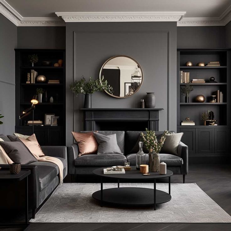
For a dramatic and stylish look, deep tones paired with lighter hues create a striking effect. Royal colour combinationsoften feature rich blues, greens, and charcoal for a sophisticated touch.
Balancing Dark and Light
To prevent dark tones from overpowering the space, balance them with lighter elements. Here are some recommended combinations:
- Charcoal Gray & Soft Gold – A luxurious, high-contrast combination.
- Navy Blue & White – Deep blue adds depth, while white keeps the space balanced.
Best For:
- Large drawing rooms needing a statement look
- Homes with a luxurious, bold aesthetic
- Creating a dramatic yet elegant atmosphere
If you’re looking for more inspiration on bold designs, explore our Top 5 Main Hall Modern TV Unit Design Ideas.
3. Vibrant and Warm Colour Combinations
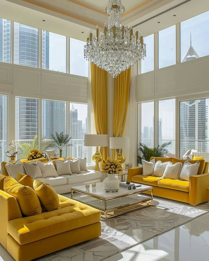
Warm tones bring energy and coziness to a drawing room. Combining reds, oranges, and yellows with neutrals creates a welcoming and lively environment.
Embracing Warm Hues
- Terracotta & Off-White – Earthy and inviting, perfect with wooden textures.
- Burnt Orange & Cream – Adds vibrancy while maintaining balance.
Best For:
- Larger living rooms needing warmth
- Homes with rustic or boho decor
- Creating a cozy and inviting ambiance
To get more ideas for cozy and inviting spaces, check out our article on 5 Simple Marble Pooja Mandir Room Designs for Home.
4. Serene and Calming Palettes

For a tranquil and peaceful space, opt for pastel shades or soft blues and greens. Light colour combinations like these promote relaxation.
Soft Blues & Greens for a Peaceful Oasis
- Pale Blue & White – Airy and calming, perfect for unwinding.
- Mint Green & Cream – Refreshing and soothing for a stress-free environment.
Best For:
- Small rooms needing a spacious feel
- Creating a peaceful retreat
- Minimalist or Scandinavian-inspired interiors
For more calming and serene colour ideas, check out our 10 Stylish Modern Mandir Design Ideas for Home.
5. Earthy Neutrals with Pops of Colour
A mix of earthy neutrals and bold accents keeps a room balanced while adding vibrancy. This approach creates visual interest without overwhelming the space.
Neutral Base with Accent Hues
- Light Gray & Burgundy – Subtle yet bold, adding depth to a modern space.
- Beige & Emerald Green – Neutral with a luxurious pop of colour.
Best For:
- Homes combining classic and modern decor
- Spaces with mixed textures and statement pieces
- Creating a sophisticated yet inviting look
For more modern interior tips, explore our guide on Top 5 Modern Cement Cupboard Designs for Indian Homes.
Common Mistakes to Avoid
1. Using Too Many Dark Colours
Dark shades can make a room feel smaller. Always balance with lighter tones or reflective surfaces.
2. Ignoring Natural Light
Test colours in different lighting conditions. Some hues may appear duller or overpowering in low light.
3. Choosing Trends Over Functionality
Trendy colours may not always suit your space. Select timeless hues that match your furniture and decor.
4. Overloading Bright Colours
Bright colours work best as accents. Avoid using them on all walls to prevent a cluttered look.
5. Skipping Sample Tests
Always test paint samples before committing. Colours may look different on walls than on a colour swatch.
Comparison Table: Best Colour Combinations for Different Drawing Room Styles
| Drawing Room Style | Recommended Colour Combination |
|---|---|
| Minimalist & Modern | Soft Beige & White |
| Royal & Elegant | Charcoal Gray & Soft Gold |
| Cozy & Warm | Burnt Orange & Cream |
| Peaceful Retreat | Pale Blue & White |
| Balanced & Vibrant | Light Gray & Burgundy |
Frequently Asked Questions (FAQs)
1. What are the best drawing room colour combinations for small spaces?
Light tones like beige, white, and soft gray create an open, airy feel. Avoid dark shades that make a room look smaller.
2. How can I add pops of colour without overpowering the space?
Use neutral walls with bold accent elements like cushions, rugs, or wall art.
3. Can I mix dark and light colours in my drawing room?
Yes, combining deep and light tones creates depth. Pair charcoal with beige or navy blue with white for balance.
4. Which colours give a royal touch to a living room?
Rich hues like navy blue, emerald green, and deep burgundy paired with gold or cream accents enhance luxury.
5. What is the safest colour choice for a timeless look?
Neutrals like beige, ivory, and light gray offer versatility and longevity in any decor style.
Conclusion
Your choice of drawing room colours sets the tone for your home. Whether you prefer classic neutrals, bold contrasts, or serene palettes, selecting the right hues enhances comfort and style. Use the comparison table and common mistakes guide to make informed decisions and create a space that feels both elegant and functional.
For more inspiration and design ideas, feel free to browse through our other guides, such as the Top 5 Luxury 3-Floor House Design Ideas in India and 10 Simple Front Wall Plaster Design Ideas.
Ready to get started on transforming your space? Contact our expert interior designers in Delhi to make your dream drawing room a reality! Visit Interior X Design today.