1. Soft Beige: A Timeless Classic
Why Beige is a Great Choice
Soft beige is a versatile and neutral colour that suits both modern and traditional halls. It enhances natural light, making the space feel bigger and brighter. This shade also allows flexibility in décor, as it pairs well with various accent colours and materials.
Vastu Benefits of Beige
In vastu, beige represents the earth element, symbolizing stability and warmth. It promotes a grounding effect, making the hall a comfortable and balanced space.
Styling Tips
- Accent Colours: Combine beige walls with blue, gold, or green accessories for contrast.
- Furniture Choices: Light wood and dark leather furniture complement beige beautifully.
- Lighting: Use warm lighting to maintain a cozy feel.
Explore our guide on simple Indian hall colour combinations.
2. Classic White: Spacious and Elegant
Why White Works Well
White is the best colour for small or dark halls as it reflects light, creating an airy and open atmosphere. It serves as a neutral backdrop, allowing furniture and décor elements to stand out.
Vastu Benefits of White
White symbolizes purity and clarity. It aligns with the air element, fostering peace and positive energy in the home.
Styling Tips
- Add Colourful Accents: Introduce bold colours through furniture, rugs, or artwork to avoid a sterile look.
- Use Textures: Incorporate textured wallpapers or fabric wall hangings to add depth.
- Contrast with Darker Tones: Dark wooden furniture or black décor pieces can add sophistication.
You can also check out our detailed article on modern ceiling designs.
3. Light Gray: Modern and Understated
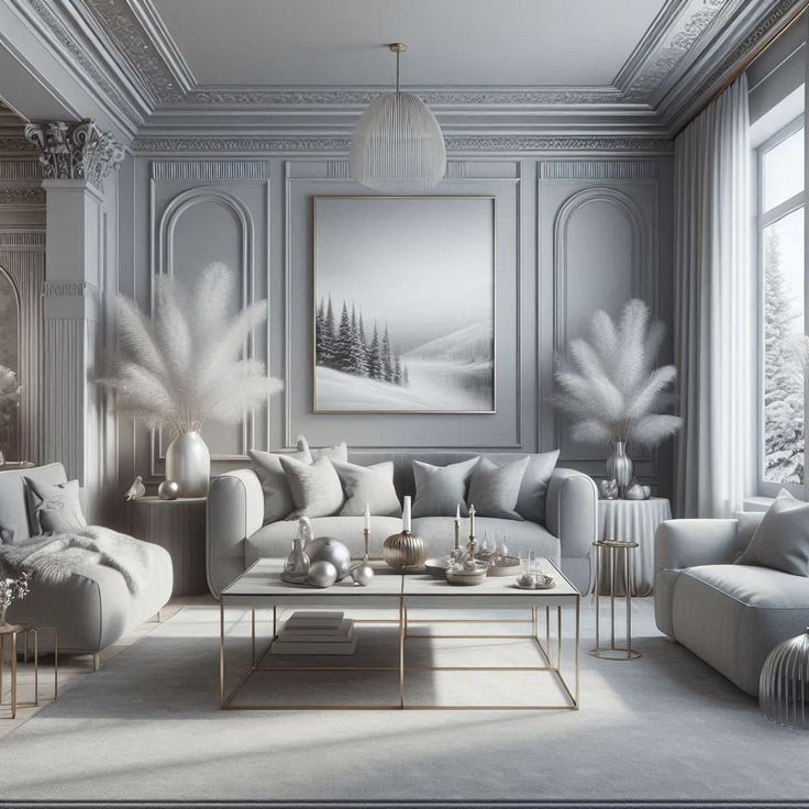
Why Light Gray is a Smart Pick
Light gray blends the elegance of white with a subtle warmth, making it ideal for contemporary homes. It provides a neutral yet stylish backdrop for various décor styles.
Vastu Considerations for Gray
Gray is linked to balance and professionalism. While not a traditional vastu colour, it works well when paired with warmer tones to prevent a cold or dull appearance.
Styling Tips
- Warm Accents: Use wooden furniture, brass décor, or soft textiles to balance the coolness of gray.
- Layer Textures: Velvet cushions, wool rugs, and linen curtains soften the space.
- Pair with Darker Shades: Combine with charcoal, navy, or deep green for a striking contrast.
4. Soft Blue: A Calming Choice
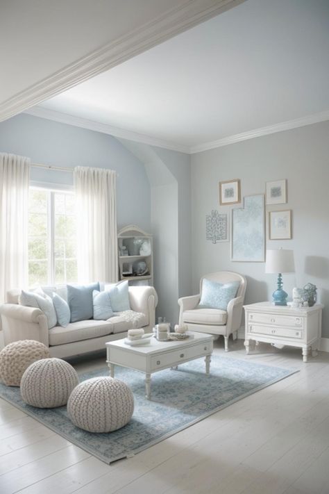
Why Soft Blue is Ideal
Soft blue creates a relaxing and peaceful environment, making it perfect for family spaces. It brings in a fresh and airy feel, ideal for homes seeking a serene look.
Vastu Benefits of Blue
Blue represents the water element, promoting emotional stability and tranquility. It supports relaxation and is beneficial for creating a harmonious home.
Styling Tips
- Neutral Pairings: Combine soft blue with whites, beiges, or grays for a balanced look.
- Add Greenery: Indoor plants contrast beautifully with blue walls, enhancing the natural feel.
- Use Soft Fabrics: Linen or cotton furnishings complement the lightness of blue walls.
Check out our modern ceiling design ideas for more ways to incorporate calming shades into your hall.
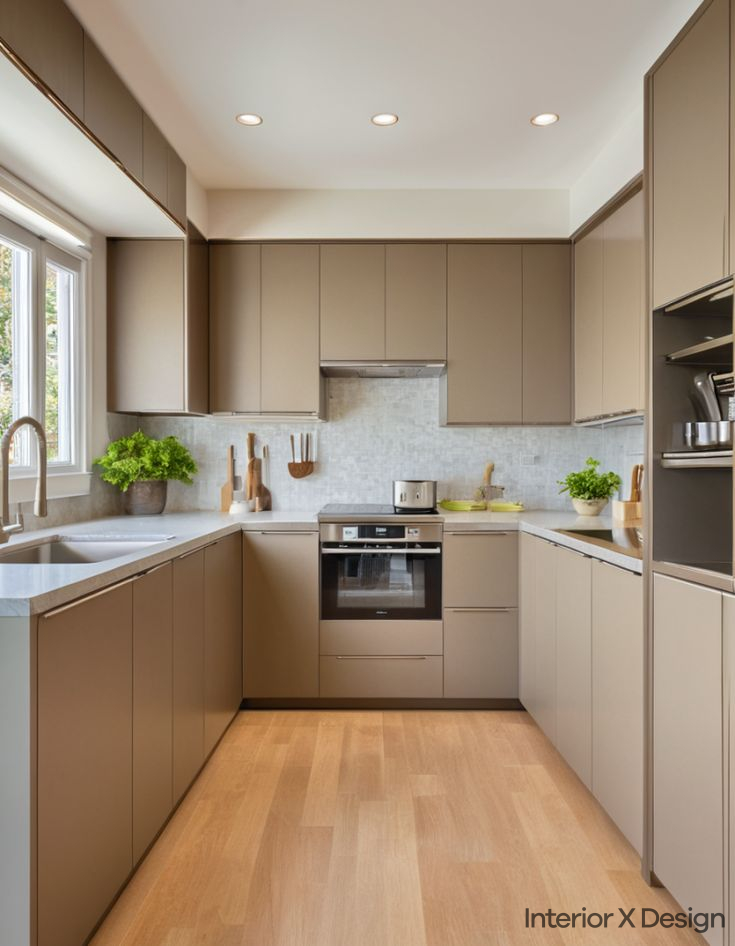
5. Warm Taupe: Cozy and Inviting
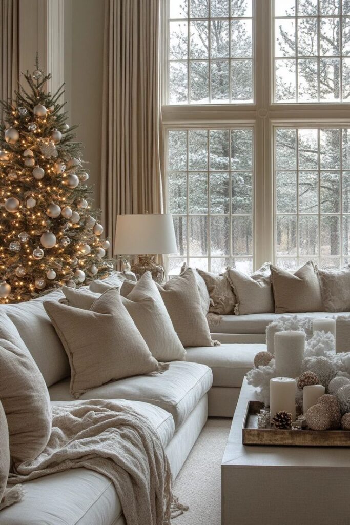
Why Taupe is a Great Option
Warm taupe sits between gray and brown, offering a cozy yet sophisticated look. It creates a welcoming environment, making it a great choice for gathering spaces.
Vastu Benefits of Taupe
Taupe represents stability and warmth, fostering a sense of comfort. It enhances communication and positive interactions in the hall.
Styling Tips
- Soft Furnishings: Use plush throws, cushions, and curtains in complementary earthy tones.
- Warm Lighting: Choose yellow or amber light bulbs to enhance taupe’s cozy feel.
- Mix with Natural Materials: Stone, wood, and woven textures add depth to taupe walls.
You can find more ideas on designing inviting spaces in our post about simple Indian hall colour combinations.
Comparison Table: Best Colour for Hall
| Colour | Best For | Vastu Benefits | Styling Suggestions |
|---|---|---|---|
| Beige | Versatile, bright spaces | Stability, warmth | Blue or gold accents, wooden furniture |
| White | Small/dark halls | Purity, clarity | Bold accents, textured elements |
| Light Gray | Modern, neutral spaces | Balance, professionalism | Warm accents, layered textures |
| Soft Blue | Calm, serene environments | Tranquility, emotional balance | Greenery, soft fabrics |
| Taupe | Cozy, welcoming halls | Stability, warmth | Soft furnishings, warm lighting |
Common Mistakes to Avoid
- Ignoring Lighting Effects: Some colours may appear darker or cooler depending on lighting conditions.
- Overlooking Undertones: A colour may have warm or cool undertones that affect its compatibility with furniture.
- Choosing Trendy Over Timeless: Avoid picking colours based solely on trends; focus on long-term appeal.
- Skipping a Sample Test: Always test paint samples on the walls before finalizing.
- Not Considering Vastu: If you follow vastu, ensure the colour aligns with positive energy principles.
Conclusion
The best colour for hall depends on your style preferences, room size, and vastu principles. Whether you prefer the warmth of beige and taupe or the brightness of white and soft blue, each shade offers unique benefits. Use the tips above to create a stylish and harmonious hall that enhances your home’s overall appeal.