Why Almirah Colour Combinations Matter
An almirah’s colour affects the look and feel of a space. The right shade can make a room appear larger, cozier, or more sophisticated. Since almirahs take up substantial space, their colour should blend with or enhance the room’s decor. Here’s why choosing the right colour matters:
- Enhances Room Aesthetics – A well-matched almirah colour can tie the entire room together.
- Sets the Mood – Colours influence emotions; warm tones create comfort, while cool tones add freshness.
- Improves Space Perception – Light colours make rooms look larger, while dark shades add depth and drama.
- Matches Interior Themes – The right colour complements modern, traditional, or minimalist decor.
Now, let’s explore the best almirah colour combinations that will elevate your interior design.
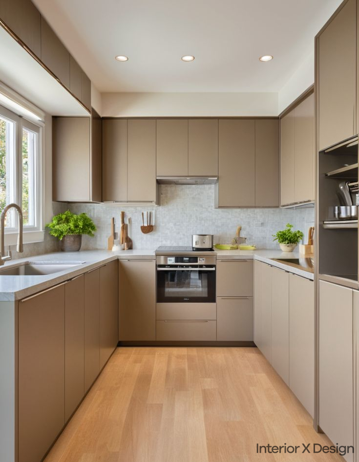
1. Classic White and Grey Almirah Colour Combination

The white and grey almirah combination is timeless and elegant. White represents purity and simplicity, while grey adds a modern touch.
Why It Works
- Neutral Appeal – White pairs well with most colours, and grey adds depth.
- Modern Yet Classic – A blend that fits both contemporary and traditional styles.
- Versatile – Complements industrial, Scandinavian, and minimalist themes.
Best Rooms for White and Grey Almirah
- Living Room – Creates a clean and spacious feel.
- Bedroom – Offers a soothing and elegant ambiance.
- Study Room – Encourages focus and concentration.
Tip: Add brushed steel or chrome handles to enhance the refined look.
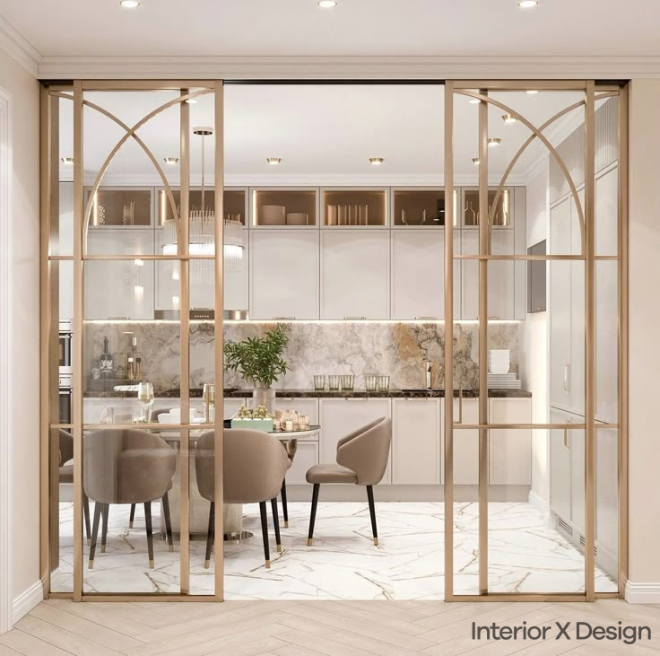
2. Warm Beige and Cream Almirah Colour Combination

A beige and cream almirah brings warmth and serenity. These earthy tones create a calm and inviting atmosphere.
Why It Works
- Earthy and Soothing – Ideal for traditional and contemporary Indian homes.
- Elegant Yet Subtle – Adds sophistication without overpowering the decor.
- Timeless Appeal – Blends effortlessly with various interior themes.
Best Rooms for Beige and Cream Almirah
- Master Bedroom – Enhances relaxation and tranquility.
- Living Room – Creates a warm, welcoming environment.
- Dining Area – Makes the space feel cozy and inviting.
Tip: Incorporate soft lighting to amplify the warmth of these colours.
3. Bold Black and White Almirah Colour Combination

The black and white almirah combination is striking and dramatic. The sharp contrast makes a bold statement.
Why It Works
- High Contrast – Creates a visually balanced and structured look.
- Modern and Stylish – Perfect for contemporary and industrial interiors.
- Enhances Visual Appeal – Makes the almirah a standout piece.
Best Rooms for Black and White Almirah
- Living Room – Ideal for a bold, sophisticated look.
- Bedroom – Adds a stylish and sleek touch.
- Office/Study – Creates a professional yet chic environment.
Tip: Use matte black with glossy white for a refined effect.
4. Elegant Gold and White Almirah Colour Combination

For a luxurious look, the gold and white almirah combination exudes elegance and sophistication.
Why It Works
- Luxurious and Regal – Gold accents add a touch of grandeur.
- Perfect for Traditional and Modern Homes – Blends well with both styles.
- Visually Striking – Instantly elevates the room’s decor.
Best Rooms for Gold and White Almirah
- Master Bedroom – Creates a royal ambiance.
- Living Room – Adds a rich and classy feel.
- Guest Room – Gives an upscale, welcoming appearance.
Tip: Gold-trimmed handles or accents enhance the overall luxury.
5. Stylish Navy Blue and White Almirah Colour Combination
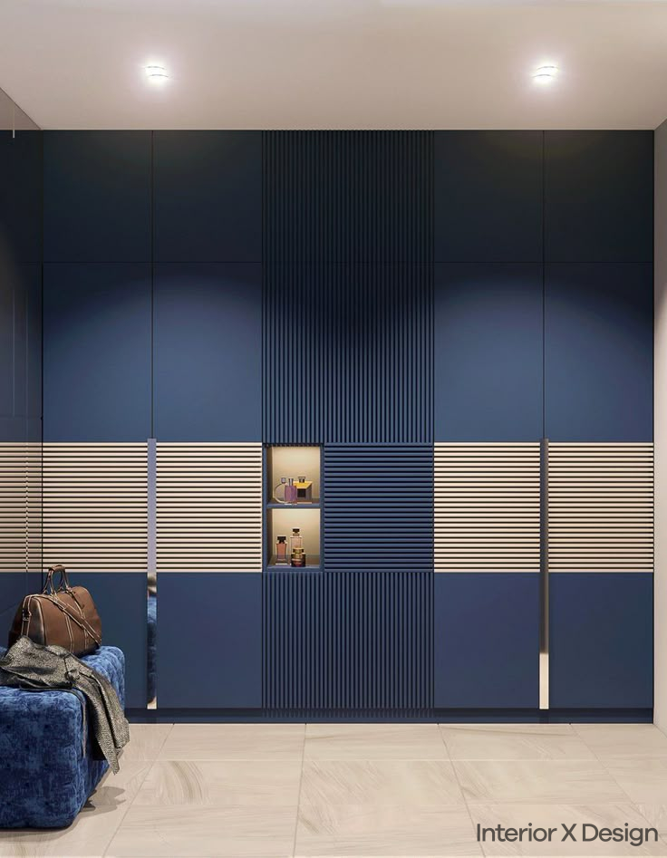
A navy blue and white almirah is both calming and stylish. This combination works well for a contemporary, nautical, or elegant theme.
Why It Works
- Bold Yet Serene – Navy blue adds depth, while white balances brightness.
- Timeless and Elegant – A sophisticated pairing for modern interiors.
- Versatile – Fits in various room styles and themes.
Best Rooms for Navy Blue and White Almirah
- Living Room – Provides a chic, calming ambiance.
- Bedroom – Ideal for a serene and stylish setting.
- Home Office – Encourages focus while maintaining sophistication.
Tip: Pair with neutral furniture to maintain a balanced look.
Choosing the Best Colour for Your Steel Almirah
For a steel almirah, the finish and hue significantly impact its presence in a room. Here are some popular choices:
- Matte Black – A modern, bold look for industrial themes.
- Ivory White – A soft, neutral shade that blends easily.
- Deep Brown – Adds warmth and richness to the space.
- Metallic Grey – Perfect for a sleek, contemporary finish.
- Classic Blue – Adds a touch of vibrancy while maintaining elegance.
Tip: Opt for powder-coated finishes to ensure durability and resistance to wear.
Common Mistakes to Avoid When Choosing Almirah Colours
- Ignoring Room Lighting – Dark colours can make small rooms feel cramped.
- Mismatched Tones – Ensure the almirah complements wall and furniture colours.
- Overuse of Bright Shades – Vibrant colours should be used in moderation to avoid overwhelming the space.
- Skipping Contrast – A single-tone almirah may look plain; contrast adds character.
- Not Considering Maintenance – Light colours may show stains easily; dark colours may highlight dust.
Conclusion
Choosing the right almirah colour combination enhances a room’s overall decor and functionality. Whether you prefer neutral, warm, bold, or luxurious tones, each option adds its unique charm. Consider your interior style, room size, and lighting before finalizing your selection.
By following these guidelines, you can select an almirah colour combination that not only complements your home but also reflects your personal taste.
For more ideas on home design, check out some of our other related blogs such as Top 5 Simple Indian Hall Colour Combinations for a Stunning Living Room or explore our Residential Interior Services.