The Power of Three: Why This Interior Design Principle Matters
I still remember the first time I learned about the rule of three in design school. My professor arranged three vases on a table and asked us which composition we preferred over a pair or solo vase. Universally, the class chose the trio. Something about the three vases captivated our eye and created visual interest in a way that the other arrangements didn’t.
In that moment, I realized the power three has in design. Over the years as an interior designer, I’ve shaped countless homes and spaces by embracing this key principle: the rule of three.
So what exactly is this mystical design concept? And why does it matter when decorating your home? I’m going to let you in on a little interior design secret…we designers are odd. Well, some of us may be, but we like odd. Numbers, that is. We design in vignettes and groupings of 3 or 5 and sometimes 7 or 9. We refer to this as the “Rule of Three.” But why do we do it and why does it work?
What is the Rule of Three?
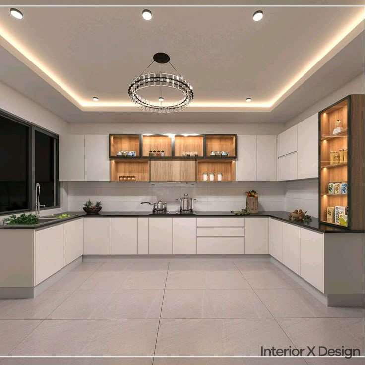
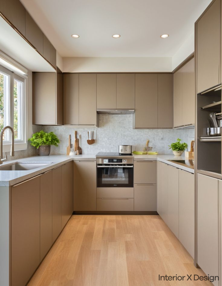
The Rule of Three is a timeless interior design principle which affects every room of your home. It dictates layout, size and shape of objects, the work triangle of a kitchen, even the color, pattern and fabric designs of your rooms.
Simply put: the rule of three says that things arranged in odd numbers are more appealing, memorable, and effective than even-numbered groupings. Three seems to the magic number, but 5, 7 or 9 works nicely as well.
This principal holds weight in interior design, graphic design, photography, storytelling, and more. It’s just how our brains are wired to prefer and process visual information.
Why Use the Rule of Three?
You may be wondering why odd numbers seem to captivate us more than even groupings. Apparently, it’s just how our lovely brains work. Here are a few reasons why the rule of three resonates with us:
- Three is the smallest pattern our minds can distinguish. It allows us to see a composition rather than a random assortment.
- Groupings of three force our eyes to move around more, creating a more dynamic visual experience.
- Odd numbers seem to expend and create more energy, while even numbers contract and condense energy. There’s a sense of movement and asymmetry.
- One object on its own is static. But three objects form a captivating composition that engages the eye.
In essence, the rule of three adds balance, interest, and a touch of dynamism through the power of odd numbers.
Elements of the Rule of Three
While any grouping of three works, there are a few guidelines to follow:
- Vary heights and sizes for lots of visual interest
- Repeat colors or textures to tie the grouping together
- Allow some asymmetry and space between objects
- Mix and match styles, from modern to traditional
Follow those tips, and you’ll have a winning triple trio in any room!
How to Use the Rule of Three at Home
It’s easy to get odd in your own home. Interior designers use this timeless trick in endless ways, from seating arrangements to gallery walls. Here are some of my favorite applications of the rule of three:
Pillows
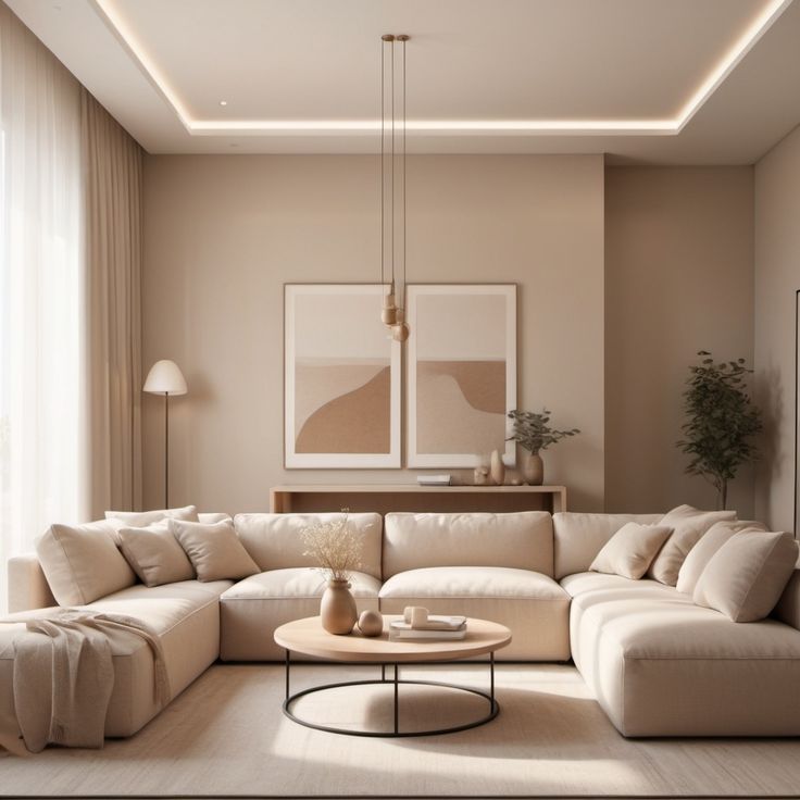
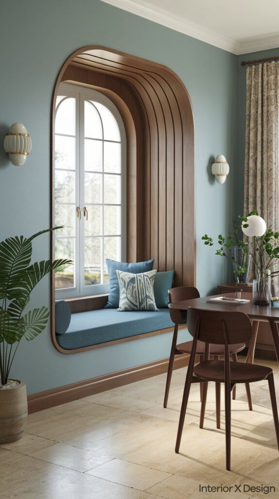
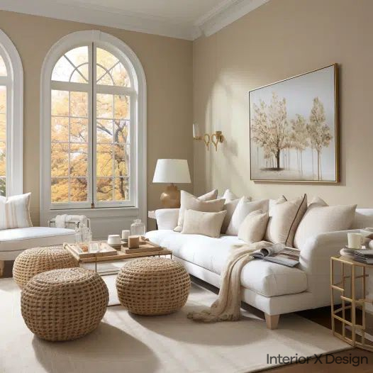
I love pillows. In fact, I can never design with enough pillows! On beds, sofas, chairs, benches, even the floor. When working with pillows, I always use odd numbers and mix colors, styles and textures. I will never put two pillows on a sofa or four on a bed. Pillows are a fun, easy way to dip your toe into the rule of three.
Shelving & Vignettes
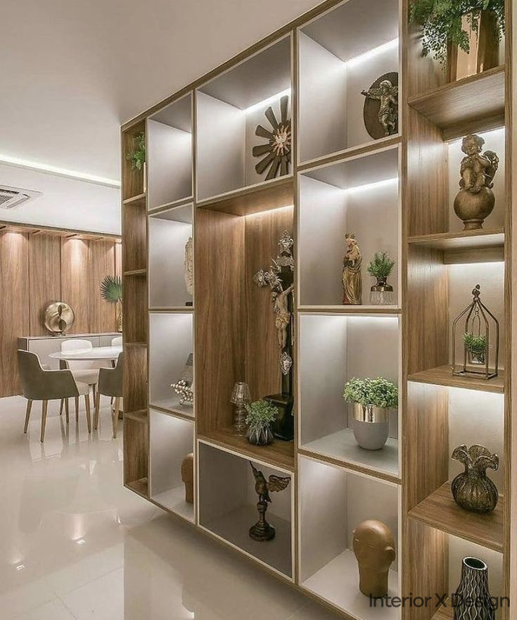
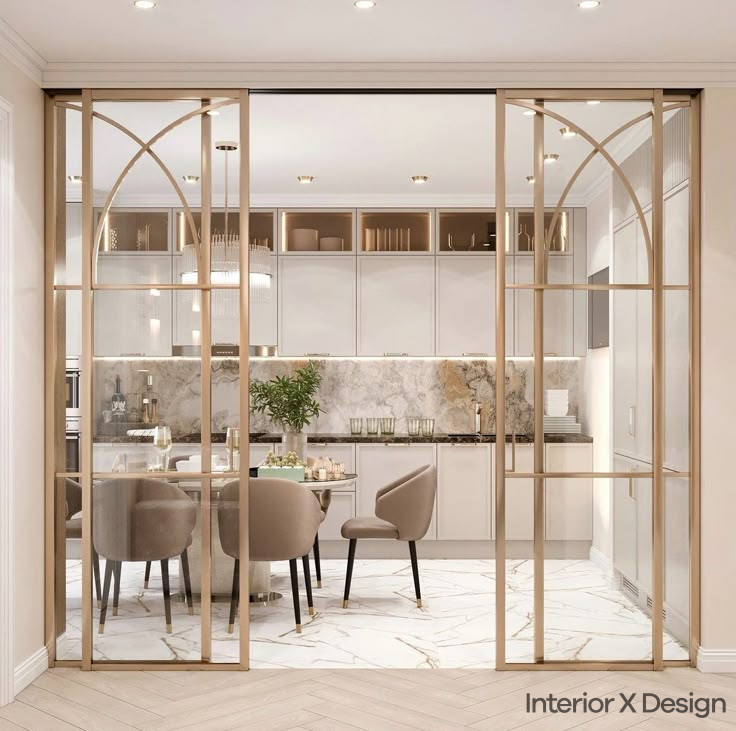
Another simple introduction to the rule of three is shelving and vignettes. Try grouping candles, vases, books, and other items in trios. Feel free to vary textures, sizes, and heights for lots of visual interest. You can also create three-piece furniture vignettes like a bench, side table, and lamp. Get creative with these micro-settings!
Artwork
Gallery walls are the perfect chance to experiment with odd numbers. Groupings like:
- Three large horizontal artworks
- A vertical column of three frames
- Five pieces clustered together
- One large piece anchored by three smaller ones
Let your creativity run wild when designing gallery walls. The possibilities are truly endless when embracing the power of three!
Lighting
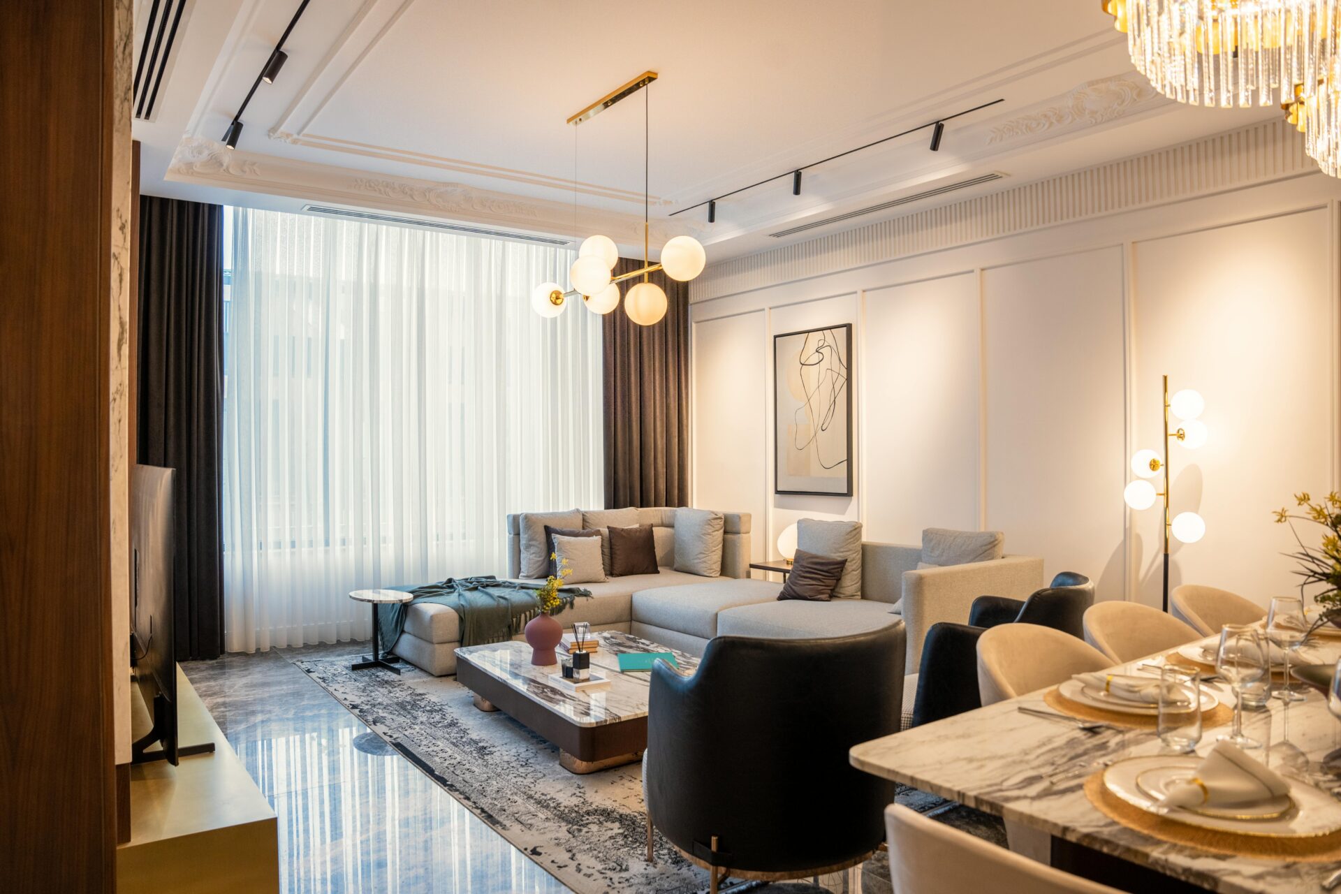
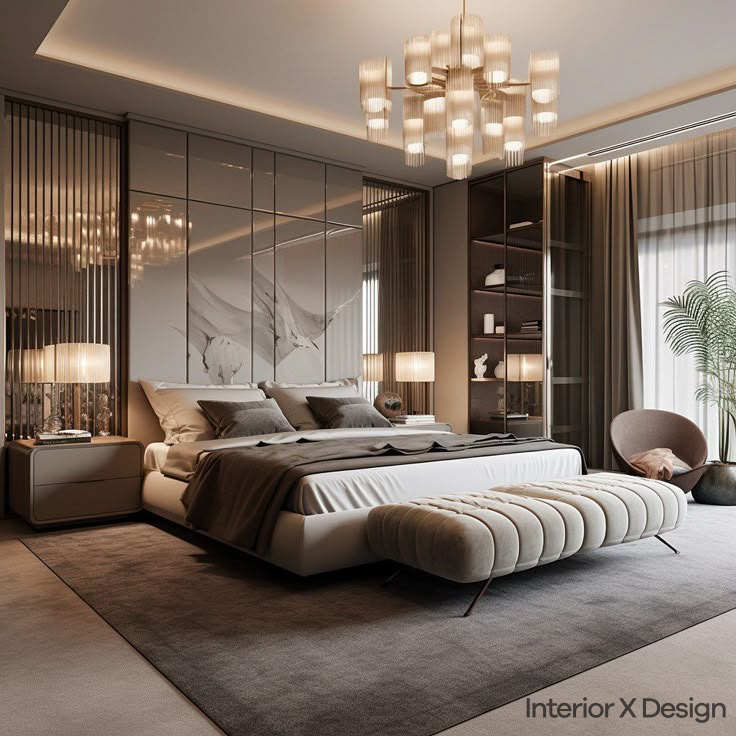
Lighting is another key application, especially with pendants and chandeliers. Three pendant lights make the perfect statement over a kitchen island or dining room table. Feel like going bigger? Expand to groups of 5, 7, or 9 lights for drama and visual impact.
Tips & Best Practices
Hopefully you’re convinced of the design magic the rule of three holds. To recap, here are my top tips:
- Start small by arranging objects like books, candles, and decor items in groups of three.
- Create mini vignettes within a room using a collection of three furniture pieces like side tables, stools, benches.
- Make the most of gallery walls with creative odd-number artwork arrangements.
- Embrace asymmetry and allow space between pieces for added interest.
- Mix and match sizes, shapes, colors, and styles in your groupings.
- Incorporate lighting into the mix with three pendant lights or sconces.
- Try out different number combos, like five artwork pieces or seven candles along a shelf.
- Allow the “gaps” between objects to create negative space and let the eye travel.
- Anchor the entire room with a memorable trio that captures attention.
- Relax the rules once you understand them! Feel free to incorporate both odd and even numbers.
Start shaking up your interiors and embrace the power of the odd. Play with unique vignettes, gallery walls, furniture arrangements and more. Before you know it, you’ll be as obsessed with the rule of three as InteriorxDesign designers!
Conclusion
Interior design principles like the rule of three have staying power for good reason. They unlock balance, energy, visual interest and rhythm within a space, engaging the senses on a deeper level. Once you train your eye, you’ll start noticing captivating compositions everywhere from cafes, to art galleries, to friends’ living rooms. I invite you to look at your home with fresh vision and to not be afraid of getting a little odd with your design!
Visit InteriorxDesign for more insider tips from top designers on elevating your home through intention and visual intrigue. What timeless principles resonate with you most? I’d love to hear your thoughts and design stories in the comments below!

